Soreen.
Delicious Squidgy Energy.
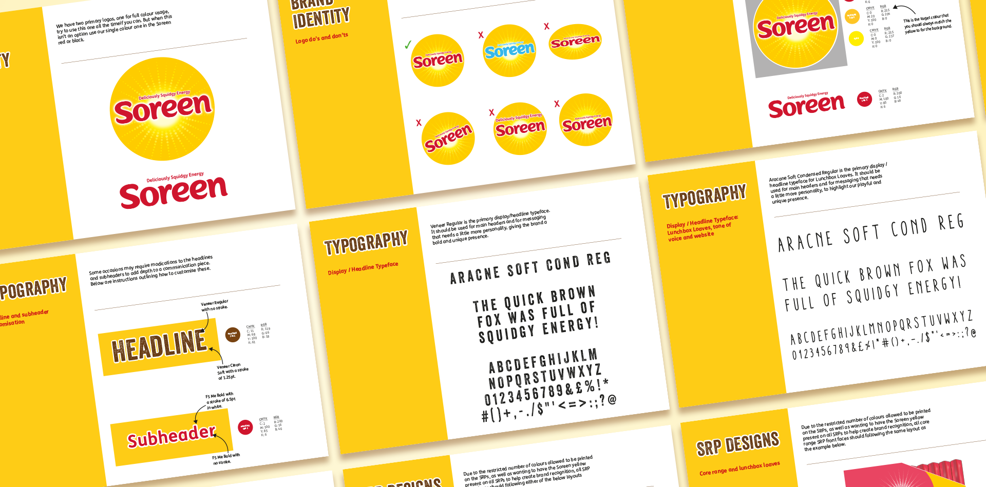
Scope of Work: Packaging Rebrand, Seasonal/Limited Edition Packaging Designs, Brand Guidelines, Art Direction, Campaigns
Industry: FMCG – Snacks
Vibe: Playful, healthy, energy, adventurous, on-the-go
Soreen, established in 1938, is a renowned British brand known for its malt loaf products. Over time, it has expanded its range to include various flavours and formats, like their lunchbox loaves. The brand sought a packaging refresh to better highlight its health benefits compared to competitors and emphasise its convenience as an on-the-go, energy-boosting snack ideal for lunchboxes.
Brand Goal
A packaging redesign that emphasises the health benefits, appeals to a younger target audience while showcasing its convenience as an energy-boosting, on-the-go snack ideal for lunchboxes.
Design Notes
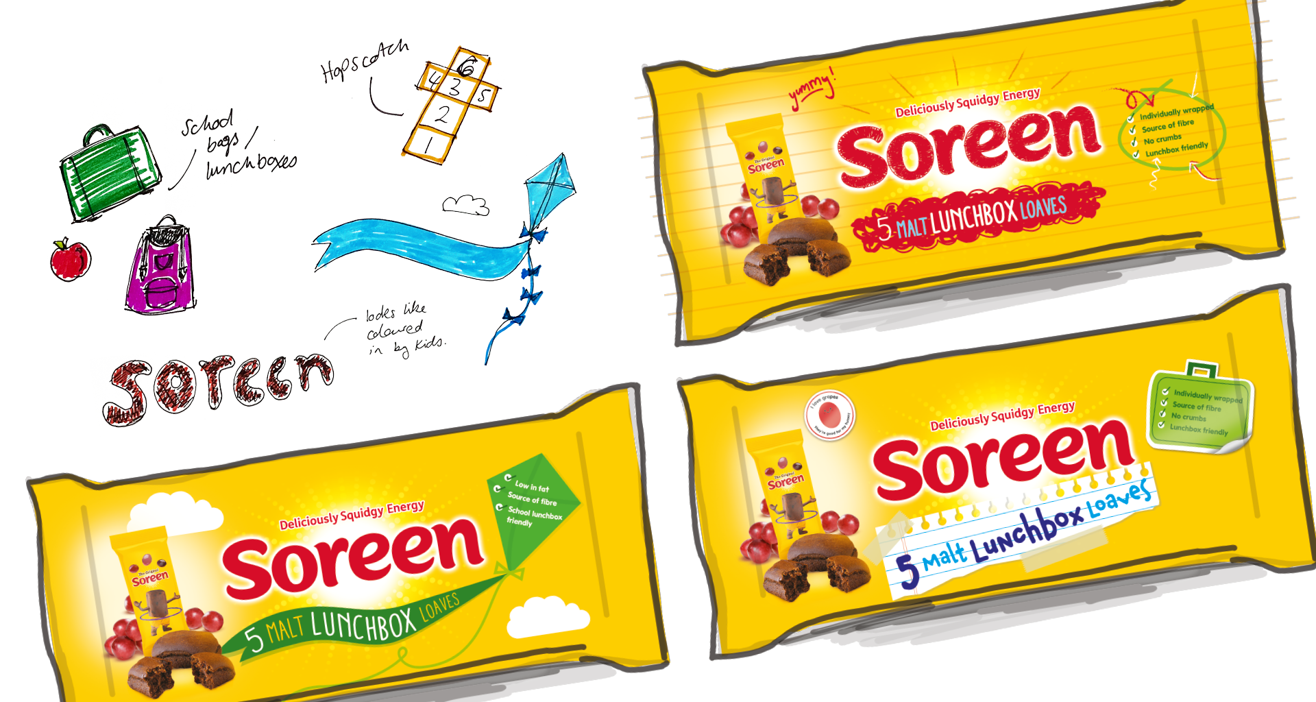
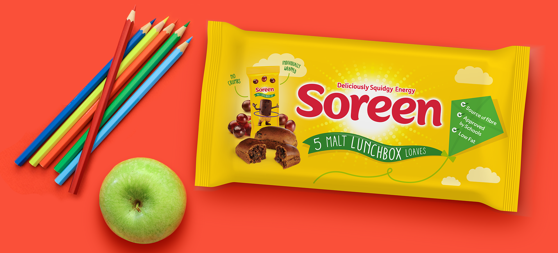
Given the logo’s prominent sun emblem, I integrated outdoor graphic elements to reinforce the brand’s on-the-go snacking theme. One key design feature that was added was the kite, which effectively displayed the product's health benefits. This kite element complemented the sun emblem, further emphasising the concept of an energy-boosting snack, perfect for active, on-the-go lifestyles.
The Results
The packaging redesign for Soreen's lunchbox loaves was a key driver of their success, directly contributing to a 9.8% sales increase by 2019.
The updated packaging effectively highlighted the loaves’ health benefits and convenience, making them more appealing to health-conscious consumers and families. By focusing on eye-catching visuals and clear nutritional messaging, the redesign improved shelf presence and positioned the loaves as a leading choice for healthier, on-the-go snacks.


